Warm or Cool? Choosing a Color Relationship for a Poster
Learn how warm and cool color relationships help poster text stand apart, guide attention, and remain legible without relying on fixed mood associations.

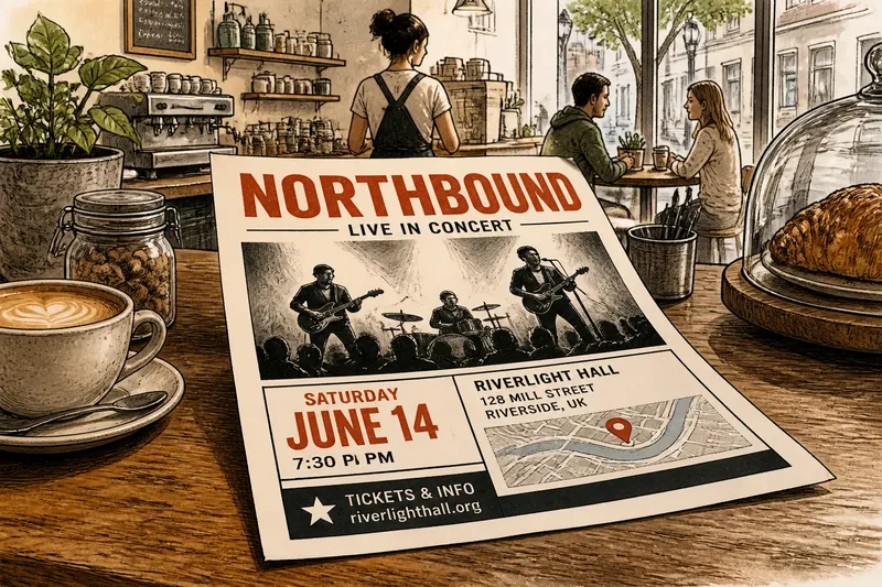
You are laying out a neighborhood concert poster: a rust-red title, a blue-green background, and a cream block for the date. The colors feel distinct, but their job is to help a reader find the event information. A warm or cool color relationship can support that task without assigning either group a fixed mood.
Warm colors often include reds, oranges, and yellows; cool colors often include blues, greens, and violets. These are useful groupings, not strict boxes. A yellow-green may seem cooler beside golden yellow, while a red-violet may sit near the boundary. For a poster, compare the colors as arranged, including their lightness, intensity, and area.
Color temperature
Warm and cool describe a color’s relative position in a familiar color-wheel grouping. They do not tell you what a color must mean. Red might signal urgency in one setting, but on a particular poster it may simply stand apart from a green-blue field.
Temperature is relational. A muted blue can appear warmer beside a greenish blue, and yellow can seem cooler beside red-orange. Judge the actual colors together, preferably at the intended sizes and positions, rather than relying only on color names.
Temperature is one cue among several. Two warm colors can separate clearly if one is much lighter or more saturated; warm and cool colors can still blur if they have similar lightness and intensity. Use contrast as well as temperature to distinguish information.
Warm and cool separation
Warm-cool contrast can help neighboring areas read as separate, even when their outlines are simple. An orange shape on a blue field may be easy to distinguish as a color grouping, while a green shape on a blue field may blend more because the hues are close. The result depends on the particular shades and surrounding colors.
This relationship can separate a title from its background, a subject from decoration, or one information block from another. It can help create a clear division without boxing every element in with rules or borders.
Temperature alone may not make text legible. If orange letters and a blue background have similar lightness, the letter edges may be difficult to pick out, especially when the type is small or seen from a distance. Squint at the design or view a grayscale copy to check whether major text and shapes remain distinct.
A warm shape against a cool background may appear to advance, while the cool field seems to recede, but this is not a dependable rule for every color or viewer. Size, overlap, edge sharpness, and placement also influence how a design appears layered.
Choosing emphasis
Give the most important information a color that stands apart from its immediate surroundings. A small warm title on a large cool field can attract attention because color and size work together. If both are highly vivid, though, the whole surface may compete rather than offer a clear reading order.
Emphasis depends on more than temperature. A large, pale cool block can dominate a small, saturated warm mark because it occupies more space. A compact bright accent can also stand out against a quiet background. Compare hue, lightness, saturation, and size with the elements nearby.
Say you are designing a community garden seed-swap poster. The event name is dark green on a blue-green background, and its edges are hard to distinguish. You change the name to warm coral and keep the date in dark green on a pale cream panel. The expected visible result is a more distinct event name and a separate date; the color change does not dictate how readers feel about the event.
Cover the decorative details and inspect the title, date, and location. If the accent makes those items easier to distinguish, it is helping the information. If it pulls attention from the event name, reduce its area or intensity, or choose a quieter accent.
Color and mood
Warm and cool groupings can contribute to a poster’s atmosphere, but they are not universal mood codes. Red is not inherently exciting, blue is not inherently calm, and green does not always signal nature. Meaning depends on the particular shade, its neighbors, the subject, and the audience’s expectations.
A vivid combination of warm colors and sharp contrasts may feel lively, while dusty rust and muted gold may feel restrained. A cool palette can seem quiet when its colors are close in lightness and intensity, yet bright blue against deep violet may look forceful. These impressions arise from the whole arrangement, not temperature alone.
Consider the poster’s setting. A warm-cool contrast may help a music event’s title separate from a dark background, while related greens may suit a garden notice where the information should feel integrated. Neither choice carries a fixed message; the purpose and context give the colors their role.
Keeping poster text legible
Check contrast at the size and viewing distance intended for the poster. A pairing that looks distinct on a large monitor may be less clear in a small print, dim light, or a busy display area. Make a rough print or view a reduced version to judge the design closer to its final use.
For small text, prioritize a clear light-dark difference between the letters and their background. Warm-cool contrast can add distinction, but it should not be the only cue. Dark type on a pale panel, or light type on a deep field, can be easier to read than two hues with similar lightness.
Keep color roles simple. One color can carry the title, another can mark supporting information, and a neutral can give both room. If every line changes color, the reader has more visual distinctions to track.
Look at the poster in color and in grayscale. The color view shows whether the warm-cool separation is visible; grayscale helps reveal whether essential text depends too heavily on hue alone. If the title disappears in grayscale, strengthen its light-dark difference or place it on a quieter field.
Palette selection
Start with the information that must be noticed, then choose a temperature relationship that helps distinguish it. Try these checks with actual swatches, such as colored paper, paint chips, or digital color blocks:
- Identify the first-read element. Check which item—event name, date, or subject—needs the clearest separation. If one item is essential, give it the clearest contrast; if several compete, revise the reading order before assigning accents.
- Compare neighboring colors. Place swatches side by side and check whether their difference is visible. If they blend, choose a more distinct hue or change lightness; if they separate clearly, try them in the layout.
- Check lightness. View the pairing in grayscale and see whether important type remains distinct. If it does not, lighten the background or darken the type; if it does, retain the pairing and check it at the intended size.
- Review accent area. Compare the accent’s space with the information it should support. If a large accent overwhelms the title, reduce its area or intensity; if the title remains the first-read element, keep the balance.
- Inspect the full layout. Put the swatches into the poster and check whether decoration competes with text. If it does, quiet the decoration or move it away; if it does not, keep the arrangement and review the smallest essential text.
- Check the print preview. Compare a rough print or printer preview with the screen design. If a color shifts enough to weaken separation, revise the swatch or choose a different paper-and-ink combination; if the distinction holds, proceed with that palette.
Follow the printer’s instructions when selecting or converting colors, since a screen preview may differ from the finished paper. For a poster meant for a particular community or venue, consider whether familiar color associations there could affect how people read the design.
Which palette questions matter?
Can warm colors work together?
Yes. Warm colors can separate through differences in lightness, saturation, or hue, even without a cool color nearby. A deep red title on a pale yellow field may read clearly because the tones differ; two similarly bright oranges may need a border or a quieter surrounding area.
Can a cool palette still feel emphatic?
Yes. Vivid turquoise on a dark navy field can make a strong distinction, and a large pale blue title can stand apart through size and lightness. Emphasis comes from contrast and arrangement, not from choosing warm hues.
What if the poster uses one temperature group?
That can work if the colors remain distinct enough for the information to read. Separate the title, supporting text, and background with differences in lightness, saturation, and area, or add a neutral such as cream, white, charcoal, or gray.
Should the background be warm or cool?
Choose the background that lets the important text and image stand apart while supporting the poster’s purpose. Test the title and smallest essential text against it before settling on a color; the better choice is the one that keeps the information clear in its intended setting.
For a warm or cool color relationship on a poster, begin with separation rather than a mood label: decide what needs to stand apart, then adjust lightness, saturation, and area until the distinction is visible. Warm or cool color relationships are most useful when they help a reader recognize the poster’s information without asking hue to do the work alone.