A Five-Minute Looking Exercise for a Busy Poster
This five-minute looking exercise for a busy poster helps you judge what stands out, check whether essential details are clear, and separate clues from assumptions.
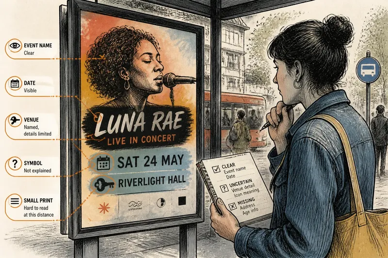
At a bus stop, a concert poster places a singer’s face beside a date, venue name, and sponsor logo. A five-minute looking exercise for a busy poster can help you judge whether its design makes the information you need easy to locate.
Choose a viewing purpose
Pick one poster you can see clearly, whether it hangs in a café, sits in a transit shelter, or appears on a screen. Decide what a viewer would need from it: perhaps the event name, date, venue, or a sense of the event’s character.
That purpose gives your looking a practical test. Instead of tracking the order in which details catch your eye, ask whether the poster makes a particular piece of information legible and meaningful.
Check the essential details
Find the event name, date, location, and any stated condition that affects attendance. If a detail is absent or too small to read, record that as a limitation rather than filling the gap from context or guesswork.
Compare each detail with its surroundings. A date printed beside a venue name may be easy to connect to the event; the same date tucked among sponsor marks may be harder to recognize. Note the relationship, not just the words.
- Check whether the event name is readable; if it is, decide whether it identifies the event clearly, and if it is not, treat identification as uncertain.
- Check whether a date is visible; if it is, decide whether it is clearly tied to the event, and if it is not, do not infer when the event takes place.
- Check whether a venue is named; if it is, decide whether the location is specific enough to identify, and if it is not, leave the venue unresolved.
- Check whether conditions such as registration or an age restriction are stated; if they are, note them as part of the invitation, and if they are absent, do not assume they apply.
- Check whether small print can be read at the viewing size; if it can, consider its information alongside the main design, and if it cannot, mark it as inaccessible from this view.
- Check whether a symbol is explained by nearby words; if it is, use that wording as context, and if it is not, keep its meaning open rather than treating a guess as fact.
Compare image and wording
Ask whether the picture supports, complicates, or seems unrelated to the written information. A photograph of a performer may identify who is appearing; an abstract shape may instead establish a mood without naming the event.
Color and contrast can also affect legibility. Describe what is visible—such as dark letters against a pale background—before assigning a feeling or intention to the color.
Separate clues and meanings
Keep visible evidence apart from interpretation. “A key icon sits beside the venue name” describes an arrangement; “the venue has a locked entrance” is an inference that the poster alone may not support.
Say you are examining an invented poster for a neighborhood film screening. Its title is readable, its date appears below the image, and a key icon sits beside the venue name, but no address is shown. You can conclude that the poster names the event and gives a date; you cannot establish the venue’s address or the icon’s exact meaning. The practical tradeoff is clear: the poster communicates what it states, while a viewer seeking the location needs additional information.
What should you check?
What if the date is hard to read?
Record that the date is present but difficult to read at your viewing distance or screen size. Do not guess at the characters; the date remains uncertain until you can inspect a clearer version.
Does a large image explain the event?
Not by itself. A prominent image may establish a subject or mood, while the title and supporting text tell you what is actually being announced.
How should you read a symbol?
Look for nearby words, repeated imagery, or a caption that anchors its meaning. Without such a clue, describe the symbol’s appearance and leave its interpretation tentative.
What if the poster leaves out a location?
Mark the location as missing rather than deriving it from the image or sponsor logo. If the poster provides a contact or event listing, that may offer a separate source of context.
Record a useful result
Finish with three short notes: what the poster clearly tells you, what remains hard to read or absent, and which visual detail may shape the impression. This keeps the assessment tied to the poster’s actual content.
For a five-minute looking exercise for a busy poster, the most useful result is not a confident story about what the designer intended. It is a clear distinction between what the poster communicates and what a viewer still needs to know.
If you see the poster in its original setting, consider whether a nearby sign or display supplies missing context. Treat that surrounding information as a separate clue, so the poster’s own message remains distinct from what its location adds.